Clicker
Project Overview
My Contributions
College students frequently exchange textbooks, furniture, and other products.
This app integrates student-to-student sales with a housing and roommate database.
I launch a lengthy research study to learn more about student-to-student sales.
I use this to design a mobile app to integrate rental housing with student-to-student sales.
One man's trash, is another man's treasure.
An integrated sales app for college exchanges.
The rising cost of university creates a need for used textbooks, furniture, and electronics alike. Clicker connects sellers with buyers in a quick, easy, and seamless experience.
Facebook and Craigslist, but for the new generation.
Clicker has the potential to become the a dominant force in the market for student-to-student sales apps. Apart from Facebook and Craigslist, very few sites are providing the services that Clicker will.
While Facebook "Free and For Sale" groups are available throughout college campuses, they are infrequently used and disorganized. In addition, most students haven't used Craigslist because it opens them to third-party strangers outside of their university.
Clicker solves all of these problems and provides an integrated experience for college sales.
Hypothesis
1. Students are afraid to sell to people outside of their community.
2. Students are unaware of student-to-student services.
3. Facebook's "Free-or-For-Sale" pages are unorganized and cluttered with spam.
4. Students have a storage of used products, but aren't able to sell it.
5. Students find it difficult to find houses or roommates.
Research and User Insights
I studied a variety of research participants to conduct a dedicated user study. Through the process, I came to a few conclusions about the user personas.

"Being a girl, I have a lot of concerns about meeting strangers outside of university."
Question Design
Tackling question bias is an important process that eliminates flawed questions. Often, this process is overlooked in product design. It's important to provide options for the participant that include both positive and negative choices.
• During university, how easy or difficult did you find reselling textbooks and furniture?
This question lacks clarity on what the student was selling. Did they only sell textbooks and furniture? What about other products like clickers, clothes, and stationaries? What about students who simply gave their furniture away?
• During university, how easy or difficult was it to resell things you didn't use anymore? (textbooks, stationaries, furniture, clickers, etc.)
• Did you give any of your used products to other students? (handing down textbooks, donating furniture, recycling products)
• Given the option, would you have sold your used products instead of giving it away?
Concept Testing
A section of the survey included a concept test By displaying examples of how the app might look like, we can determine if it would well-received by users before completely finalizing the front-end and back-end processes.
• What is your initial reaction to this concept?
• How unique is this concept compared compared to other products currently available?
• How relevant is this concept to you personally?
• I would utilize this concept regardless of ads.
• During university, I had trouble finding houses to rent and roommates to rent with.
One of the most important questions through this set is user willingness to utilize the product regardless of ads. The entire business model revolves around generating advertisement revenue. A product needs to be sustainable in order to provide a long-lasting service. If it's not sustainable, we can't build up a large loyal user base.
Through these services, it's very difficult to patent a particular concept. Market competitiveness arises from the dedicated user base.
Competitive Analysis
By studying the market, I was able to understand how to implement a successful product. Facebook's "Free-and-For-Sale" groups had the most amount of similarity to the goal I wanted to achieve.
• Student-verification—requiring .edu emails to enter the group
• Student-to-student transactions—students are able to meet and sell to each other
• Housing—students can find rental properties to lease or sublease
• In person—students avoid the loops of taxes, payment, and shipping.
• Ease of access—easy and simple to use
Other sites like OfferUp and Craigslist offered similar services, but lacked the exclusivity of student-to-student sales. I hypothesize that there is social fear attached to students meeting with strangers outside of their community.
Personas
There are several types of college students in university. We focus on the three main personas who we predict will use our app.
Incoming Sophomore
Needs furniture for housing (post-dorm)
Needs to find houses to rent, and roommates to live with
Graduate
Wants to find new tenants to take over their lease
Wants to get rid of old furniture before graduating
Everyone else
Needs to find old, cheap textbooks for new classes
Wants to get rid of old, used textbooks from previous classes

Problem
After studying user sentiments through the research process, I was able to determine three key problems in the market to fix.
I. Stranger Danger
Students are afraid of interacting with those who are outside of their tightly knitted community.
II. Housing
Rising sophomores struggle with finding proper housing (rental or sublease) and potential roommates to live with.
III. Connection
Even if students wanted to sell their products, many of them found it difficult to match with others who needed them. Groups were cluttered and filled with spam.
How might we create a solution that integrates rental housing with student-to-student sales in a way that is safe, easy, and satisfying?
Sustainable business models
Before even designing the app, I thought of what Clicker should do and how it can generate profit. Creating sustainable products is important for competitive applications.
Clicker brings people together
Clicker revolves around a supply-and-demand model. Many students end up throwing out their textbooks because they can't find students who want them. The goal of the app is to connect all of these students and bring them together.
Users translate into revenue
Clicker optimizes student-to-student sales in a free and easy experience. To maintain this business model, access to the app must be free. Clicker can earn sales through user data collection, ad revenue, and in-app purchases.
Brainstorming Concept Designs
After analyzing user sentiments and generating conclusions on sustainable business models, I began the brainstorming process to think of a possible solution. This is when I came up with Clicker.


Why Clicker?
In university, clickers were one of the most popularly traded products. Students would trade them back and forth with one another to save money. Clicker embodies the spirit of student-to-student sales in a memorable way.
Wireframing
After I had a clear idea of my business model and the goals that I wanted to meet, I began my designing process in Figma. I began to explore a wide variety of solutions through low-fidelity wireframes and mockups.


Balancing aesthetic and efficiency
I wanted to create a cool, aesthetic, clean app for users to sell their products on. But after looking at several marketplace apps, I noticed a trend in dense interfaces. It could be less cluttered, but it wasn't. I attributed this to a focus on usability and efficiency.
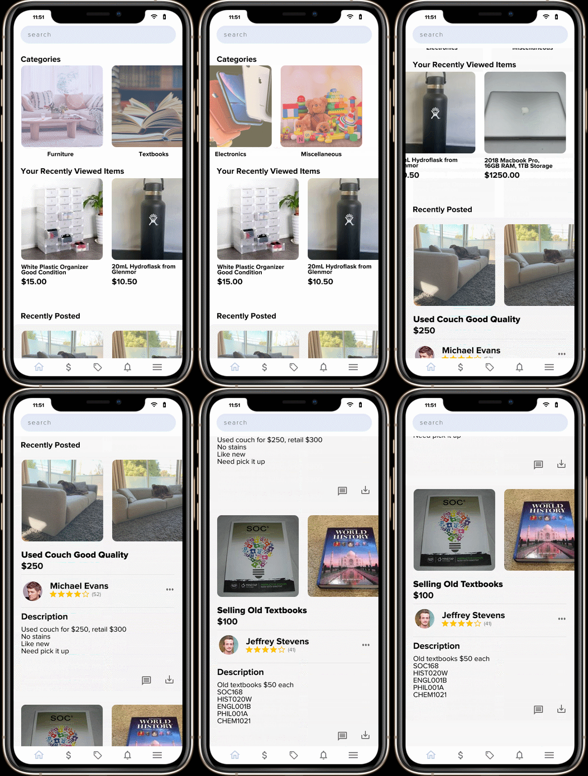
Horizontal and vertical scrolling
By combining horizontal and vertical scrolling, I created a more interactive app that more thoroughly captures the user. Having two dimensions of scrolling also assisted with organization to create a cleaner app—the latter being a long and endless scroll.
Baby colors for the youngsters
To create an aesthetic and appealing app, I added lighter colors across the board. In areas that needed more emphasis, I used bolded black. Having the font, Proxima Nova, also assisted in creating a modern and symmetric look.

Prototyping the Model
I wanted to create a cool, aesthetic, clean app for users to sell their products on. But after looking at several marketplace apps, I noticed a trend in dense interfaces. It could be less cluttered, but it wasn't. I attributed this to a focus on usability and efficiency.


Getting User Feedback
After the first run-through of the design, I had a solid direction of where I wanted to take the app. However, some areas of the app could be improved so I did further pilots of the app with its new features.
I. Categorical Images
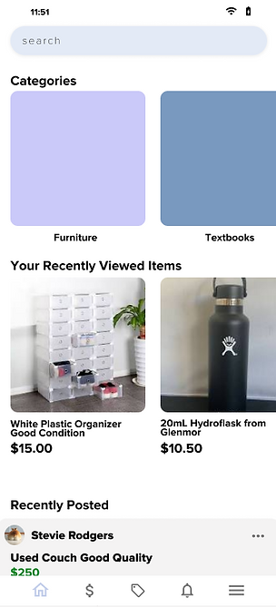
A hefty amount of users mentioned the lack of categorical images on the market page. Originally, I had decided that colors would be a unique and aesthetic way of displaying categories but it was poorly received by the pilot testers.
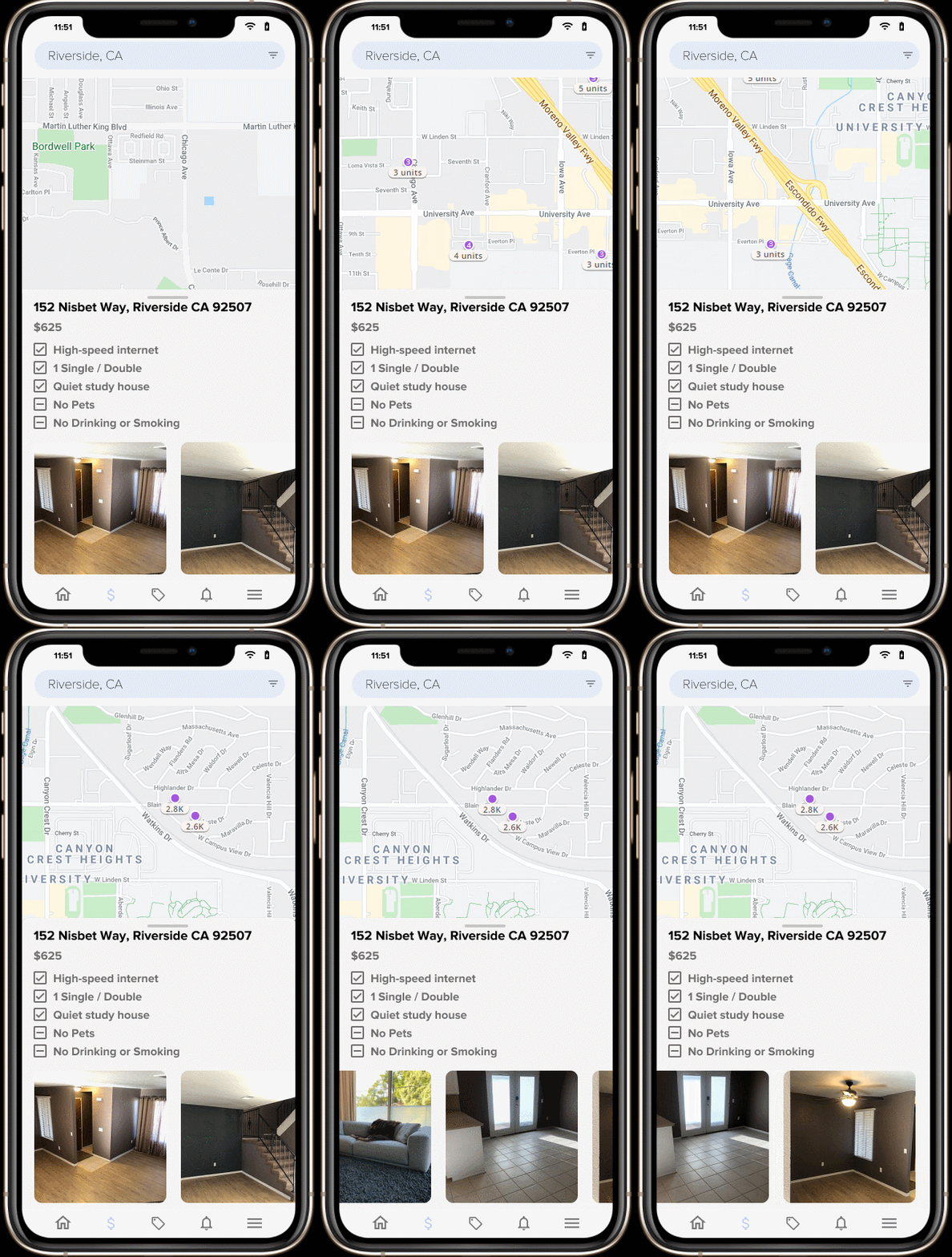
II. Map Typography
While it was compact and simple, users thought it was too cluttered and disorganized. At first, I wanted to display as much information as possible, since it would be important information when a student decides to search for houses.
III. Home Screen
One struggle with the home screen was the design. Nothing particularly made it stand out to users when they saw the design. It was too similar to other designs and didn't offer any ratings information about the seller.
Iterating on Feedback
Considering what I gathered from usability testing and user interviews, I went through the designs to make several revisions. Since the product proved to be useful to users, I primarily focused on the design of individual pages.
I. Using stock images as overlays
Adding categorical images was the simplest change. I used several stock images and put them as an overlay for the original pastel colors. This allows users to differentiate the categories from the purchasable items in other sections.
II. Decluttering the map
By removing long lines of text, I created a more simplistic and general overview of the rental property. Since students gather most of the information through texting the sellers, having a general outline of amenities will create a simple filtering process.
III. Spice up the landing page
After doing some competitive research, one of the issues that arose was the similarity to other websites. It would be seen as a "knock-off" copy to a preexisting solution. While this is not the case, that was the message it was sending.


80%
of students would use the application regardless of ads
Every successful business model requires a sustainable source of income. Clicker has the potential to take over the market as the most popular student-to-student sales app. With a potential user base of millions of students worldwide, Clicker can distribute ad slots to companies around the world. Through user research, I determined that ads would not substantially impact the user base.
What can clicker do for you?
Clicker gives you the opportunity to sell your used products to other students. Since university is incredibly pricey, it's super important for us to save a few bucks when we can. As a fellow university student, I'm confident that Clicker can empower you with the opportunities to save.
Dissecting Survey Design
In retrospect, some of the survey questions could have been better improved.
• During university, I had trouble finding houses to rent and roommates to rent with.
This is an example of a double-barreled question. Often, many of these questions are asked but it is flawed because users can't respond to one or the other, only both. By using this question, we eliminate the possibility of finding out if students possibly struggled with one, but not the other.
A better-designed question would be:
• During university, I had trouble finding houses to rent.
• During university, I had trouble finding roommates to rent with.
Another area that it can be improved is the scope of the question. Does it limit people who live in dorms, apartments, or commute? These are also people answering the questions, so we should determine whether their opinion will impact our previous two questions.
If a student lived off campus, they may not have had to find houses or roommates. As a result, they would answer accordingly, and that would negatively impact data.
• Did you commute from home, live off campus, dorm, or live in an apartment?
This allows us to know whether the student had to face the experience that we are trying to examine. Using the Qualtrics logic function, we can choose to only display the two questions, only if they have had to find off-campus housing or apartments.
A limited pool of respondents
With a limited pool of respondents, we are unable to get a solid representation of each community at hand. By gathering a more diverse group of respondents, we can get a less-biased group and formulate more concrete research studies.
Imagine the population that we should be surveying is a pie. In this scenario, we are simply taking a single piece of the pie and saying that the entire pie is bad. However, it could be the case that it just happened to be that the slice we chose was bad.
To get a more representative study, I could have used Amazon MTurk's platform to set quotas that will only select a certain amount of people from a specific category. We can set a category based on ethnicity, job, location, and so on.
Usability Testing
After creating a more in-depth model, I could have conducted a usability test to determine whether students are able to use the app efficiency. This can be done through Figma's prototyping feature to create a general model of what the user will be able to do. A usability test is used to determine whether users can perform certain functions without having previous knowledge of how it works.
How would we do this?
First, we would need to complete the prototype on Figma. By creating a complete layout of every single and function, we would be able to put together a working prototype. Then we can distribute the prototype to users to test, and scale their ability to perform certain functions.
Sites like UserZoom and UserTesting can provide us with users that will record their screens as they operate key functions on the application. In a scenario where I'm unbound by financial limitations, I would use these sites to gather key information.